The objective of this post is to analyze the “visual characteristics” of three of my favorite websites. That is to say, I am going to identify where my eyes take me while browsing the webs, which elements of them stand out more, and the reasons for that. Concretely, the websites I have choose are: “Marca” ─the most popular sports newspaper in Spain─ “VICE España” ─the Spanish version of the worldwide famous magazine─ and “El País” ─one of the most renowned newspapers in Spain and in Europe─. Thus I will consider three different perspectives of the media landscape.
Marca
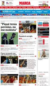 Marca is an Spanish sports newspaper founded in 1938. It is the most sold newspaper in Spain, and its online version is the second most accessed media website in the country, only outpaced by Youtube. Besides its news and contents, the popularity of Marca‘s website is due to its attractive layout.
When you start browsing through Marca‘s website, the first thing that catches your attention is the great amount of photographs and videos. The layout of the website is based on a vertical succession of news with big headings and one photograph or video related to the story. In my opinion, this is due to the powerful visual effect of the photographs and videos, that are the first elements of the news noticed by your eyes. Thus, while you are browsing the website, you unintentionally check the pictures of the news and look for the ones that most interest you ─maybe those that show a specific sport, your favorite player, or a curious fact─. Only when your eyes focus on one of the pictures instead of just having a look at it, you read the heading and decide either to read the full story or not.
However, as we already know, “multimedia” is a combination of elements, and not only a single picture or video. This means that we also have to consider other elements when talking about what stands out most of a website. One of these elements is the typography. As Vic Costello states, “typography is one of the most important yet frequently overlooked elements in multimedia design”. Even if a story has an amazing photograph, you will not read it if the typeface used by the newspaper has a bad legibility and readability. Concretely, Marca’s website uses a “humanist sans serif” typeface, similar to Calibri, that is adapted for being displayed on computer monitors and other electronic devices. The newspaper also uses the boldface type in to add emphasis to the headings.
To sum up, the website of Marca presents an appealing design in which the pictures and videos represent the most significant elements. However, it is the combination of these elements with the typography what makes Marca an attractive medium in terms of design. This sports newspaper is the perfect example of how you can improve the design without losing the traditional touch of it.
VICE Spain
Vice is a Canadian magazine founded in 1994 by Gavin McInnes, Suroosh Alvi and  Shane Smith. Initially, it was launched as the Voice of Montreal, but in 1996 the creators changed the name to Vice and focused the contents on arts, culture and news topics. Nowadays, the magazine ─which has 29 bureaus in all the world─ is well-known because of its politically incorrect stories and language.
The Spanish online version of Vice, as well as the original website of the magazine, perfectly mixes striking photographs with a noteworthy typeface. When you enter in the website, your eyes start to scan each picture and to read each heading until one of stories really get your interest. The digital design is similar to that Sara
Dickenson Quinn, in her article “New Poynter Eyetrack research reveals how people read news on tablets”, call “carousel design”. VICE Spain‘s website presents a picture, a remarkable heading, and a short summary of each story in a well-organized space.
As in the case of Marca‘s website, I think that VICE Spain combines really good its design elements. First of all, the quality of the pictures gets the attention of the readers, whose eyes take them from one image to another. In addition, the headlines are written with an attractive sans serif typeface with right proportions, big size, and a boldface style that really stand out the words. The total of these elements result in a great design that catches the readers’ attention, making the choice of the story they are going to read a really hard decision.
El País
El País is an Spanish newspaper founded in 1976, after the death of the dictator Fran co and during the political change in Spain. Thanks to its quality content, t became a symbol of democracy and rapidly increased its popularity. Nowadays, is the second most sold newspaper in Spain, only surpassed by Marca, the sports newspaper whose web I have already analyzed.
Unlike the other two websites that I have described before, El País‘s website is not characterized by the abundance of photographs. On the contrary, the headlines are what stand out most, the elements in which the eyes of the readers focus first. El País is a medium that covers the most important national and international news, so its digital design must be both elegant and serious. Only the most important news have photographs, which are thought as a support for the text. The headlines are written in a big size and using a boldface style to add emphasis. However, it is a serif typeface that contradicts Vic Costello’s recommendation of not using this kind of typefaces for the digital display, since “digital technologies can have trouble displaying serifs”.
Anyway, nobody can deny that El País‘s website follow the popular adage that says “less is more”. The design is traditional and subtle, yet it allows the readers to focus in the element that actually communicates the ideas and information: the text. This medium does not use garish visual elements to catch the attention of the audience. On the contrary, it uses the photographs sparingly and just to support the headlines. While browsing this website, your eyes jump from story to another, looking for one that truly get your interest. Maybe El País‘ website has a more austere layout in comparison with the ones of Marca and VICE Spain, but it is equally valid and, foremost, it accomplishes its objective.
